The popularity of DIY website platforms allowing users to create and publish their own content has soared. Using a Professional Web Designer was once a necessity yet nowadays it is considered an unnecessary expense because ‘everyone is a designer’ right?…. WRONG.
Professionally designed websites are always superior to those produced by those who are inexperienced and untrained in the theory of good design so we are sharing some of our design secrets to help you make your website stand out from the crowd.
Many publishers of online content do not have the background knowledge on which to base their design choices, that’s why we have decided to publish a series of blogs on ‘The Basics of Design’ for websites.
Our tips will help you make the right choices, because when it comes to design, there’s a lot to consider!
This article focuses on the frequently debated subject of Text Alignment.
TEXT ALIGNMENT OPTIONS
There are four main types of typographic alignment.
- Left Aligned
- Right Aligned
- Centre Aligned
- Justified Alignment
So the question, which text alignment works best for your website?
Let’s start by looking at examples of each style and what they are used for.
Left Aligned (ragged right)
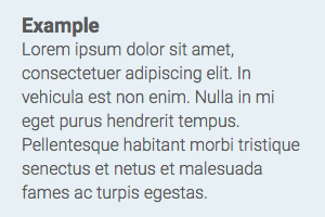
Left aligned text is flush on the left hand side and ragged on the right.
In traditional print media left alignment is usually used for:
- A4 sized documents
- Magazine articles
- Correspondence
Right Alignment (ragged left)

Common uses for right aligned text include:
- Numbers in columns
- Pull out Quotes
- Testimonials
- Price lists
Text which uses right alignment is great to use for pricing tables, buttons and for a call to action, but longer paragraphs create a difficult reading experience since our eyes are trained to read left to right.
Centre Alignment (ragged left & right)

Text which is centre aligned is primarily used for
- Posters
- Headings
- Introductory paragraphs
While centre aligned text can be used very well in a product banner or for the title of an article, it simply does not look good in longer paragraphs and can be difficult to read due to being ragged on both the left and right margins.
Justified Alignment (flush left & right)

Text that uses justified alignment is commonly found in:
- newspaper columns
- books
- contracts
- legal documentation
Text which uses justified alignment is NOT recommended for websites. Many people argue that because justified text is used in publishing for newspaper columns and books it must be easier to read. In fact when it comes to websites, the reverse is actually true.
Newspapers and books usually contain narrow columns of text which is a fixed width. Digital media is designed to be responsive when viewed on multiple devices. For example, the width of your website text looks different when viewed on a mobile compared to a desktop or tablet. Therefore, the length of the text block is not fixed and it becomes increasingly difficult to control the way the text appears on different browsers and devices.
If your text is not broken up into narrow areas or small blocks on your web page, justified text is not as easy to read and can look seriously ugly. To create even left and right margins, extra spacing is added between words and this produces particularly undesirable results.

Hyphenation
To get around the ugly spacing issues, newspapers and book publishers use hyphenation to control the line endings so that the spacing between the words does not become irregular. This level of control is not even a remote possibility on websites and as a result, the legibility of your web documents will suffer if you set your text to justified alignment.
Clients frequently comment that justified text looks ‘neater’. It may look neater but it’s harder to read and if the purpose of your text is to be read and comprehended, then it’s simply not JUSTIFIED
Why you shouldn’t use justified text on your website
In summary, here are just some of the reasons to avoid using justified text on your website.
- It is harder to read
- It is visually unattractive
- Hyphenation is not available on most browsers
- Line endings can not be controlled when viewed in responsive design
- Not recommended by W3C Web Standards
- Access issues for people with cognitive and visual impairment
World Wide Web Consortium recommendation
According to W3C (World Wide Web Consortium) justified text causes problems for readers with cognitive disabilities. See here
Many people with cognitive disabilities have a great deal of trouble with blocks of text that are justified (aligned to both the left and the right margins). The spaces between words create “rivers of white” running down the page, which can make the text difficult for some people to read. This failure describes situations where this confusing text layout occurs. The best way to avoid this problem is not to create text layout that is fully justified.
When designing your site you also need to consider many visually impaired readers will be using ‘screen readers’ to access your content and justified text presents a barrier for this. Google ranks your site higher if it is considered accessible to all users.
SUMMARY:
When it comes to effective website design, there’s a lot of theory regarding, typographic knowledge, colour and font choices, copy writing, branding and image optimisation which all need to be considered. If good design matters to you, there are at least 100 things you need to be aware of… so here’s our recommendation.
Step One: Contact eSense and let us take care of the other 99 things.